
Redesigning the Provider Search Experience
Making it faster, clearer, and more inclusive to find the right provider
Top Takeaways (TLDR)
1. Users want flexibility and clarity in search
People have varied needs when looking for providers—some prioritize location, others specialties or insurance. The redesign focused on enabling clear filtering and multiple ways to browse (list vs. map) to support those differences.
2. Real user feedback revealed key pain points
Through surveys and usability testing, Katie uncovered major frustrations, like unclear filters and clunky navigation. These insights directly shaped the design decisions, showing the value of listening to users early and often.
3. Accessibility isn't optional—it's essential
Improvements to contrast, touch targets, and map usability made the experience more inclusive and accessible, helping all users—not just those with specific disabilities—navigate the tool more easily.
The Challenge
The provider search experience was clunky, confusing, and not serving users the way it should. We heard consistent feedback from both internal stakeholders and real users: the interface was slowing them down instead of helping them make confident decisions.
Here’s what we were up against:
Filters weren’t working hard enough – The filter panel felt unintuitive and overwhelming, leaving users frustrated and unsure how to narrow results.
A static map – Each provider card included a tiny, non-interactive image of a map—hardly helpful for people trying to find care nearby.
Hard-to-read results – The layout lacked visual hierarchy, making it tough to quickly scan and compare providers.
♿ Accessibility gaps – Low contrast, small touch targets, and unclear interactive elements created major usability barriers for many users.
The Approach
We set out to reimagine the experience from the ground up—prioritizing clarity, flexibility, and accessibility.
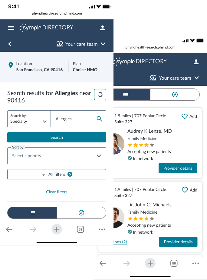
Smarter filtering – We reorganized and simplified filter options to reduce cognitive load. Clearer categories and a more intuitive layout helped users refine results without second-guessing their selections.
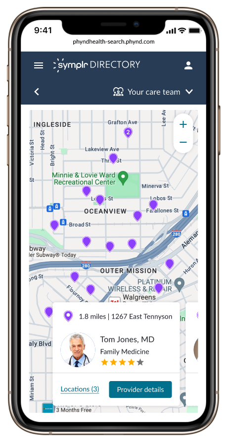
Fully interactive map – We replaced static thumbnails with a full-screen, dynamic map view. Users can now zoom, pan, and toggle between a map or list view—giving them more control over how they browse.
Streamlined provider cards – We introduced a clean visual hierarchy, making it easier to skim, scan, and compare at a glance. The cards now surface key info up front, with smart use of space and typography.
♿ Accessibility-first design – All updates follow WCAG AA standards, from contrast ratios to touch target sizes to clear interactive states—ensuring a more inclusive experience for all.
Research
We need to understand the challenges consumers and health systems face with the tools consumers use to find a provider.
Purpose
Survey - 222 participants
Usability testing - 8 participants (4 over the age of 65, 4 under the age of 65)
Method
Map and List Views: Participants value both map and list views for different purposes, appreciating the geographical context of the map and detailed information in the list.
Usability Issues: Improve visibility of interactive elements like the apply button and ensure clear information is displayed on the map.
Filter Options: Enhance the filtering options to include insurance type, star ratings, gender, distance, level of education, specialty, and research focus.
Interactive Elements: Maintain and enhance interactive features like swipe cards, star ratings, and visual doctor profiles to engage Participants.
Insights
-
The Directory Web App is a highly customizable product. Our customer support team partners with our customers to curate a personalized app experience, down to the level of turning on and off individual pieces of data. This means that I needed to consider a wide variety of customer needs.
How did I solve this:
I designed and mocked up 3 different customer personas for both the Desktop and Mobile version:
1. Customer incorporates minimum amount of data
2. Customer incorporates maximum amount of data
3. Customer falls in between the minimum and the maximum -
More than 50% of users surveyed said they prefer to search for providers on their mobile device. The web app is currently designed for a desktop experience, and so building mobile first was going to be important!
How did I solve this:
Wireframing and defining the interactions was the most important step in building this experience mobile first. And then I conducted stakeholder reviews with the mobile interaction prototype. These reviews included Product, Engineering, UX and UI to gather feedback and concerns before proceeding. -
The engineers built the web app with Material UI and although we have our own Design System (Alloy), this project was constrained to the current way engineers are working. I needed to build with Material but style it to look consistent with Alloy.
How did I solve this:
I first designed all of the high-fidelity mocks using Material UI’s component library and styling guide to ensure that engineers would be able to build it. Next, I used our Alloy style guide and my knowledge of our Design System to as closely align the designs to our Design System as possible. The work also went through Alloy Review with the UI team to ensure that it met the standards.
Unique constraints
Current experience

Desktop

Mobile

Design Strategy
Design goals and key decisions:
Clarity — Simplify filtering and search paths
Control — Let users choose how they navigate results (map vs. list)
Scannability — Surface key info, fast
Inclusivity — Design for all users, from the start
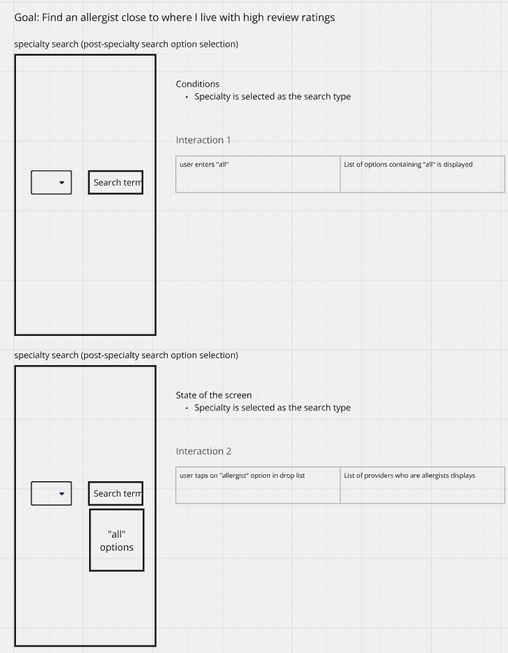
Defining Interactions
I used Miro to wireframe and define the interactions of the user’s workflow with the following goal in mind:
Find a bilingual, female allergist close to where I live with good ratings.


Lo-fi Prototype
I converted the interaction guide into a low fidelity wireframe using Axure.
Then, I presented this prototype to all product, engineering, and UX team stakeholders for feedback and alignment on the interactions, UI, and direction going forward.
The Solution
Before

After

Designing Hi-Fidelity Comps
(Desktop)
-
Mimicked the interactions on mobile for as much consistency between devices as possible.
-
In our initial research, we heard from a large number of participants that being able to see the map in full view would be a helpful feature - so I’ve included the option here.
-
Users can easily navigate between the map and list view depending upon their preference for viewing the search results.
Hi-fi Prototype
Take a minute to write an introduction that is short, sweet, and to the point. If you sell something, use this space to describe it in detail and tell us why we should make a purchase. Tap into your creativity. You’ve got this.
Concept Testing
Solution
The final solution consisted of 4 core improvements:
Accessible, mobile first experience, with extra consideration for an older user base and accessibility. Updated the designs to meet the WCAG AA guidelines, ensuring usability for all.
Interactive map using a full screen map that user can interact with in a myriad of ways. Implemented a map and list view so the user can toggle between seamlessly.
Enhanced filters that are prominently placed to encourage use with an added sort by menu to better personalize the results list.
Improved results layout with provider cards that prioritize important information (ratings, proximity, availability) allowing users to scan and compare providers at a glance and make more informed decisions.
Impact
Proposed impact:
Increase in user satisfaction
Decrease in search abandonment
Faster search completion time
*This feature will be implemented in mid-2025.