
Consolidating 2 mobile apps for a unified platform

In support of our shift to a single platform, I consolidated two key mobile applications into one cohesive experience—reducing friction for providers and aligning with our long-term product strategy.
Top Takeaways (TLDR)
1. Design can unify disconnected systems.
Merging two previously siloed apps required more than just feature parity—it meant rethinking how workflows should feel in a new context. I focused on designing an experience that felt native to Clinical Communications while honoring the power of Physician Scheduling.
2. Shared vision beats separate roadmaps.
The biggest unlock was getting cross-functional teams aligned. I led workshops that brought engineering and product together across both apps, building a shared understanding that enabled faster decisions and smoother execution.
3. Great design thrives under constraints.
A three-month timeline meant tough prioritization. I scoped an MVP that solved real provider pain points—like transferring shifts and viewing the full schedule—without sacrificing usability. We shipped on time and laid the groundwork for future enhancements.
Context
In the world of healthcare, efficiency isn’t a luxury—it’s survival. And yet, many providers were stuck toggling between two core tools: symplr’s Physician Scheduling, where they manage shifts, and Clinical Communications, where they coordinate care. These apps had been built in silos. They looked different. They behaved differently. And they didn’t talk to each other.
Providers were frustrated. They’d check one app for their schedule, then jump to another to message a colleague or post a shift trade. This constant back-and-forth was draining precious minutes and adding friction to already demanding days.
That’s when we asked:
What if we could bring scheduling into Clinical Communications—no app-switching required?
We had 3 months.
The Mission
Bring three major scheduling features—full schedule views, bulletin board announcements, and shift transfers—into Clinical Communications.
One experience. Fewer taps. Less mental load for providers.
But this wasn’t just a copy-and-paste job. It was a strategic systems-level merge:
Two apps with separate design systems
Two product teams with different goals
And one very real deadline
Goals
Improve provider efficiency by reducing app switching
Unify the user experience across symplr’s ecosystem
Bring key scheduling features into Clinical Communications without overwhelming the interface
My Role
As the lead UX designer on this effort, I acted as the glue between strategy and execution. My job was to:
Audit both products and define a shared user experience strategy
Reimagine Physician Scheduling features in a Clinical Comms context
Align stakeholders across product, engineering, and clinical teams
Rapidly prototype and test with real providers
Deliver clean, dev-ready designs under an aggressive timeline
The Strategy
-
We began by mapping out the ideal day in the life of a provider. What should it look like?
We saw opportunities to consolidate:
Viewing schedules in-app during a shift
Checking bulletins for real-time updates
Quickly transferring shifts without opening a second app
-
We needed to rethink the architecture of how scheduling could live inside Clinical Communications without overwhelming it. This meant:
Embedding, not duplicating: Keep interactions lightweight and focused
Prioritizing mobile-first design, since most users access Clinical Comms on the go
Abstracting complexity: Let providers take quick action without digging into admin-heavy screens
-
I facilitated working sessions between two separate product and engineering orgs—people who had never collaborated before. We created a shared component library, aligned on MVP scope, and synced our sprints to hit a shared launch date.
One of my proudest moments? Proposing an accordion within the monthly calendar view to surface shift details without overwhelming the screen. It struck the perfect balance between visibility and usability—and got immediate buy-in from both product and engineering across two teams who had struggled to align for months.
Defining Interactions & Workflows
Bringing Physician Scheduling features into Clinical Communications required more than just migration—it called for strategic integration across two previously siloed systems.
Together, we mapped out end-to-end user flows, prioritized MVP functionality, and iterated on prototypes that bridged two previously siloed systems.
How We Worked Together:
Product: Aligned on user goals, workflows, and trial-specific use cases
Engineering: Identified technical constraints early to ensure feasibility
Design: Defined interaction patterns and streamlined task flows for a new context
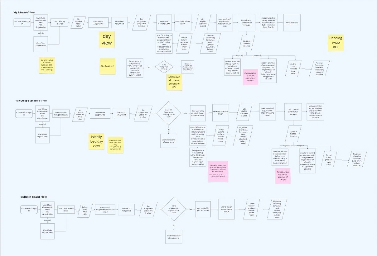
Product Workflows
Wireframing
With strategy aligned, it was time to translate big ideas into tangible screens. My wireframing process helped shape how key Physician Scheduling features would live inside Clinical Communications.
Goal:
Design workflows that feel native to Clinical Communications while preserving the power of Physician Scheduling.
What I did:
Created low-fidelity wireframes to explore layouts and flows quickly
Focused on edge cases and provider-specific pain points
Adapted complex scheduling tools into a cleaner, communication-first UI
Ensured seamless transitions between new and existing features
Wireframes as a collaboration tool:
Used early sketches to align product and engineering
Facilitated quick decision-making and cross-team feedback
Identified technical constraints before high-fidelity design
Iterated fast to simplify workflows and reduce cognitive load
Wireframes
Designing Across Platforms
Building for Clinical Communications meant designing a consistent and intuitive experience across iOS, Android, and desktop—meeting providers wherever they are during their day.
📱 Mobile First, But Not Mobile Only
Designed mobile-first for quick, on-the-go interactions during clinical workflows
Accounted for platform-specific guidelines (Material Design for Android, Human Interface Guidelines for iOS)
Ensured familiar patterns like tab bars, swipe actions, and native input behaviors felt natural and responsive
Optimizing for Desktop
Scaled layouts to support more complex workflows and higher information density
Leveraged screen real estate for calendar views, schedule filtering, and multi-step tasks
Maintained consistency in visuals and interactions while adapting to keyboard/mouse navigation
What Stayed Consistent
Core interaction patterns
Visual hierarchy and UI language
Accessibility standards and touch targets
Final Designs
Building for Clinical Communications meant designing a consistent and intuitive experience across iOS, Android, and desktop—meeting providers wherever they are during their day.
Key Elements:
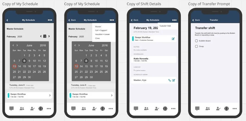
Monthly & Daily Schedule Views:
Built for quick scanning and interaction, these views mirror the layout providers are used to—now optimized for mobile and desktop.Accordion in Monthly View:
One of the most celebrated details: a collapsible accordion that keeps the UI clean while giving providers instant access to shift details without leaving the screen.Bulletin Board Integration:
Designed to surface timely updates and announcements directly within the scheduling context—reducing the need for separate tools.Shift Transfer Workflow:
A streamlined, end-to-end interaction that allows providers to initiate and manage shift swaps in just a few taps.Cross-Platform Cohesion:
Interaction patterns, layout behaviors, and visual language were tailored to iOS, Android, and desktop—while maintaining consistency in experience.
Designed with (and around) our Design System, Alloy
I leveraged Alloy, our in-house design system, to ensure visual and functional consistency across the desktop experience. However, because Alloy doesn’t currently support mobile, we had to get creative.
Adapted desktop components to behave intuitively on mobile while still feeling visually aligned
Extended the system where needed, introducing mobile-friendly patterns and ensuring they still conformed to Alloy’s design language
Collaborated with engineering to validate interactions and styling across platforms, maintaining a cohesive feel despite the system gaps
Documented decisions to help inform future development of mobile design system standards
This dual effort allowed us to deliver a polished, cross-platform experience while setting a foundation for expanding Alloy to mobile in the future.
iOS

Android


Desktop
Impact
Providers will no longer have to choose between communicating and staying on top of their schedule. We brought both into one intuitive flow which will lead to":
Reduction in app switching behavior
Shift trades completed faster
Higher user satisfaction
What I Learned
Design can drive strategy when you're willing to lead across silos
A shared vision is stronger than shared ownership—once teams saw how this helped providers, alignment followed
Speed doesn't have to mean sacrifice if you focus on what matters most to the user
What’s Next
This integration was just the first step. Next up: intelligent schedule insights inside Clinical Comms—so providers don’t just see their shifts, but get contextually aware alerts, recommendations, and reminders.